Here are my favorite comic book covers for the week of August 9, 2018.
These were my favorites…
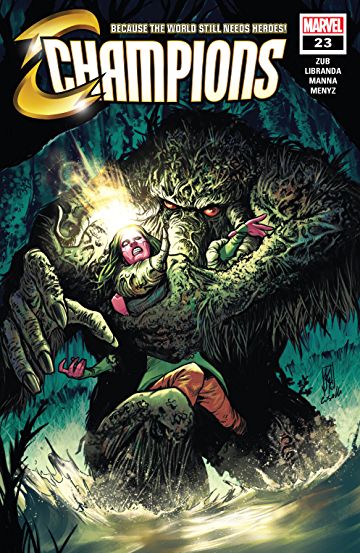
Champions #23 (cover art by R.B. Silva)
Fantastic Four #1 (cover art by Esad Ribic)
Hal Jordan and the Green Lantern Corps #50 (cover art by Tomeu Morey, Rafa Sandoval, Jordi Tarragona)
Old Man Logan #45 (cover art by Mike Deodato Jr.)
Plastic Man #3 (cover art by Zander Cannon, Alex Ross)
Sideways #7 (cover art by Kenneth Rocafort)
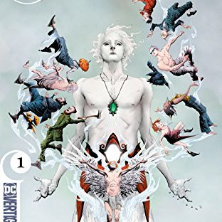
The Sandman Universe #1 (cover art by June Chung, Jae Lee)
Which were your favorites?
And Our Theme Search Continues…
Our search for a new-look blog continues. To be perfectly honest, I hated yesterday’s theme. “Rosalie” (Monday’s theme) remains my favorite. But we’re not done yet! Two more features followed by a few write-ins and THEN we decide. In the meantime, mull over “Verity”.
Nope, forget “Verity”. Every time I activate it, it keeps defaulting to yesterday’s theme. Let’s move on to “Bari”.
Nope! It just keeps defaulting back to yesterday’s shit theme. Okay! Time to bring in the professional!
1st place this week: Sandman Universe.
Sideways & Plastic Man tied for Second.
This theme is better. Everything on one page with
your work, twitter posts & pics of faves on right hand side to fill
the white void.
I’m still voting for Monday’s Rosalie though. She had the most personality.
Ya just need to see if the over sized banner can be brought down in size a bit more.
just discovered …..
Apparently this theme only allows you to view the most recent comments on the main page.
You have to click back through multiple pages to read all the comments for any particular day.
Is this better?
Better. Thanks.
#1 Sideways
#2 Sandman
good grief….verity is not so good and if you did try another one…also, not so good.
For a very brief period, verity was a real blog page with content on side and in middle.
BUT…this did not last long.
For another brief moment, kinda liked Champions…but now, not so much.
ruby rose is batwoman on cw
Hey! I actually like this one the bestest! Nicely organized, and everything that makes your blog “you” is on the right side bar. Yes, bring in the professionals (Ivon?) and see if you can get this one to work.
I like this theme better than yesterday as it has the sidebar back. But the comment section is awful. The comments are listed in reverse chronological order so the newest comments appear at the top meaning if you want to follow a conversation you need to start at the bottom and read upwards. Plus they’re paginated as @Drea just mentioned. These may be configurable, though.
Old Man Logan is great! Although it looks as if Bullseye is upset with Logan.
We watched Deadpool 2 last night. Absolutely LOVED it. I liked it even more than the first. I haven’t laughed so hard in a long time, and I really needed that.
Hey there! I haven’t had a horse in the new layout race as I read your blog through RSS (feedly). Today though I noticed that I can’t read the full entry via RSS, I have to click the link to go to your site directly to finish reading. This is less than desirable as I like to do my reading in one consolidated tab. 🙁 I did not have this issue with any of the other layouts you attempted this week. Just my two cents!
This one’s good but really, I could get used to any of them.
Drea: Thanks for that cartoon the other day!
Maggiemayday’s going through a hard time with a sick hubby. Does anyone know if she’s going to do a gofundme or something like that?
why does this set up look different today than yesterday?? Joe did you do something? My first thought was… what the hell?
Is this a new format? It’s a little glitchy. When I scroll down, the header kind of “smears”. I’m using Chrome.
Old Man Logan. Green Lantern. Sideways.
Enjoying the new font. Been gone for a week on vacay at Myrtle Beach. Tried to minimize my social networking to a minimum. Lots to catch up on it seems.