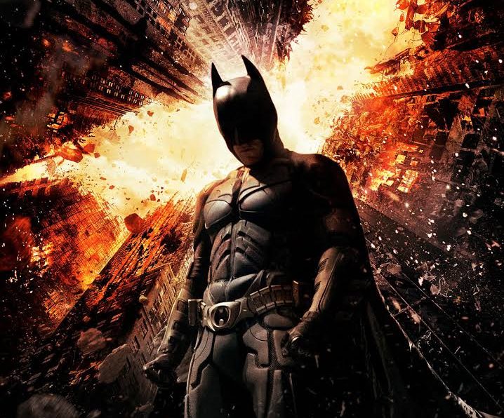
So yesterday, on Twitter, I posted my rundown of the Best Modern Day Batman. It went something like this:
#6. Val Kilmer
#5. Ben Affleck
#4. George Clooney
#3. Michael Keaton
#2. Adam West
#1. Christian Bale
My reasoning was as follows: Bale demonstrated the most dramatic range, but West was the most likable. Keaton broke new ground in his portrayal, yet Clooney delivered an underappreciated performance in the worst Batman movie ever made. Affleck tries too hard while Kilmer tried not at all.
The internet weighed in with love for West, Keaton, even Clooney. But a sign of support was shown for voice-actor Kevin Conroy.
A New Poll For You
Today, I leave it to you, dear readers. YOU have the final say. Who is The Best Modern Day Batman?
More Themes…
Our search for a new WordPress theme continues. The response to yesterday’s theme, “2016”, was better than the previous day’s, “Text Book” – yet it was not without its detractors. Some felt the black type on white background hard on the eyes. Still, others bumped on the space-wasting border surrounding the screen and the unwieldy font. Ultimately, I can do something about the color palette and fonts. The borders, not so much.
And so, on we go to candidate Number 3: “Rosalie”. Thoughts?
Nolan’s movies stand far above the rest and still are the best Batman movies. However I personally like Keaton’s portrayal.
My logic as well.
What about Lego Batman? He’s got the best singing voice.
Did you soften the white? I like it.
Lego Batman is pretty great. I believe Will Arnett would make a fantastic live action Batman in the future. That’s a script I’d love to write.
I have only seen one Keaton Batman film and thought it quite dark.
Did not like it. I did watch West in 60’s Batman, the tilting cameras always made me queasy but it was a fun show.
I do hope MGM gives Stargate a reboot and stays true to canon. I will remain hopeful but I am Leary of fully trusting that TPTB even hear us, long suffering Stargate fans.
And to repeat yesterday’s post, I would love to see a new Star Trek series, but not on CBS all access. Not paying to watch.
I also don’t care for this stark theme. It looks awful on my mobile phone
I like this minimalist design, it is simple, but it shows all the information in a simple way. I assume the Dark Matter banner picture is just for testing purposes. Otherwise, consider changing the image to a bigger picture to avoid pixelation 🙂
Yes, the banner can be adjusted.
I like this theme ‘Rosalie’ – it’s clean, neat, and kinda trendy. But that pixelated banner is just…terrible. Sorry. Also, Michael Keaton for the win.
Better?
Way better 🙂
Much better 🙂
I like how Rosalie looks on my cell screen. A tad Deco, a tad futuristic. Perfect for a sci-fi expert and bon vivant.
I quite like Rosalie – feels open and friendly. I like how the Comments section looks too. Yep this is nice.
Call me old but I still love Adam West as Batman. The baddies in that Batman series were the best – Eartha Kitt as Catwoman has never been bettered.
You’re old!!!
.. but so am I. Best Batman by far.
Series low number two for Killjoys after only three episodes.
Episode 3 – 369k, 0.05 18-49
If only there was a fun popular Scifi show by two talented former Stargate writer/producers to get viewers watching Syfy on Fridays.
My exact thoughts and rant for the past year.
Nice and responsive theme, nothing too crazy going on, no horrible borders, nothing really bad at all. I think this is my favourite, so far.
Maybe switch on full front page posts, though?
Adam West by a country mile.
I like this theme best so far!
Adam West because I’m old too. I couldn’t choose a best theme without seeing them side by side by side by side…. Oh well, lots of good feedback from everyone.
I’m liking the Rosalie. Looks nice and clean. Like TheOtherOne, I also like how the comments page lays out.
I don’t have a Batman preference, but Chris O’Donnell will always be my Robin.
This theme is my favorite so far.
I like the Rosalie theme – very pleasing, easy to read, and lots of neats widgets.
I voted for Bale, but Clooney did well with horrible material. 🙂
Hi Joe
Can you adjust the font in any of these? Something sans-serif, I find this one very hard to read.
Elminster
ditto. had to put my reading glasses on to see comments section.
It really does have a whole lot more personality than “2016” though
It feels too bright for me – lots and lots of white. Or maybe I’m just tired and my eyes hurt from that. Still missing the pup.
Rosalie is crisp, easy on my eyes, although she’s not cuddly or warm. Maybe the white could be a tad more ivory, or even a pale green or blue. Overall, I rather like her.
Adam West, because he was my first Batman. Keaton very nearly got my vote though, but I cannot turn my back on Wham! Pow! Bang!
I think the guys on the BigBangTheory and Adam West said it best.
I don’t like the ‘Reading time 1 minute.’ It’s unneccessary information, I think. Also would it be possible to have the latest post completely shown, rather than having to click Read More? Thanks.
If significant support was shown for Kevin Conroy why didn’t you add him to the poll? As someone who grew up with Batman: The Animated Series he will always be the only Batman for me. He was also the first Batman to use a different voice for Bruce Wayne, if I recall correctly. Diedrich Bader was pretty fun voicing him in Batman: The Brave and the Bold as well. He was to Kevin Conroy what Adam West is to Christian Bale.
On another note, I just saw the Stargate episode “Window of Opportunity” again. I didn’t realize you had a PhD Joe! And know Latin!
https://imgur.com/lmLWHns for reference.
I think for Movie Batman it is a tie between Bale and Affleck. I was surprised how much I liked Affleck because going into Batman V Superman I thought he was a terrible choice, and he knocked it out of the park. But Bale did a great job as well, and he had the low Batman growl down to a T. But I agree you should have had a write in option as I also would have voted Conroy as best, just as Mark Hamill was the best Joker.
I like this theme better than day 1, and maybe a little better than yesterday. I really like the DM cast picture you have on the page, and it is easier to go down to a previous post than the other ones so far.
Yep this is the best theme so far, simple and classy. Plus the comments section is nicely formatted.
Keaton. It’s not just watching, but the memory of the part.
I like this much better, but less white if possible
Adam West by default. (Didnt watch any BM after the original).
Wonder if there is a theme that combines 2016 & Rosalie?
This one has more personality
but yesterdays had the easiest to navigate and read layout.
Which ever one everyone ultimately decides upon, when you put up a new banner pic
hope you will consider posting ALL the babies side by side.
Maximus, Jelly, Brie, Bubba, Lulu, Suji.
(my all time fav photo of Bubba is him in his wizard costume)
Also I notice WP seems to have taken away the search option??
I was just about to go search for a couple good photos of Brie when I noticed
the search bar icon missing atop
.
I’m still happiest with “2016”. Don’t care for the huge headers. Also don’t want to click again to read the entire post. The ultimate laziness…
Bale, hands down, for the most realistic portrayal. No camp or comedy.
I like this theme layout, although I’m not sure how I feel about the headline format and having to click the article.
I like this one better than the other two. It reads well on the mobile and the desktop. It’s simple but it has a nice clean design
Hmmmm…. I think the reason some may be finding the last two themes ‘too white’, is the missing third lower right box that displayed pics of productions you worked on before.
It doesnt have to be limited to SG DM & transporter either.
You can display Paddington, Wimzies House, etc. etc
If that doesnt fill the right side of the page? Search for a theme that offers a 4th lower right hand side box for favorite books, art and music.
Rosalie is nice. I like the way the posts are teased with a drop down for more reading but you can see older posts without having to scroll as much.
Like this one the best so far. Clean looking, easy to read and I like the way you can see the comments easily. It is also nice to be able to quickly see previous posts easily.
I like the Rosalie theme! The header picture is very badass (can you really expect anything less from the crew of the Raza? (: ) and I like the cute little diamond underline thing. The layout is actually better on my iPad though – the header picture is not as tall, so you can read the title of the blog upon visiting the webpage. On my PC I have to scroll down a bit before you see ‘Joseph Mallozzi’s Weblog’.
This theme falls apart on mobile completely. You have to scroll down 2-3 screens before getting to the latest article. What I like is that the type is grey rather than black, it’s subtle but it makes it an easier read. Still prefer the styling of the second theme(fonts and structure), with a few adjustments.